ASO Best Practices: make the most of your screenshots
Creative Assets
October 31, 2022

Screenshots are a staple of ASO strategies. They’re a cornerstone of app stores conversions and an essential of app’s product pages. However, there are some rules to follow to ensure they have a positive impact on downloads and are sufficiently memorable and clear to convince users to give your app or game a try.
About screenshots
Visual assets have a meaningful impact on user behavior. According to Storemaven, App Store users are 10x more likely to scroll through the Gallery than read the app’s description. Creatives are more attention-grabbing and will deliver your message quickly.
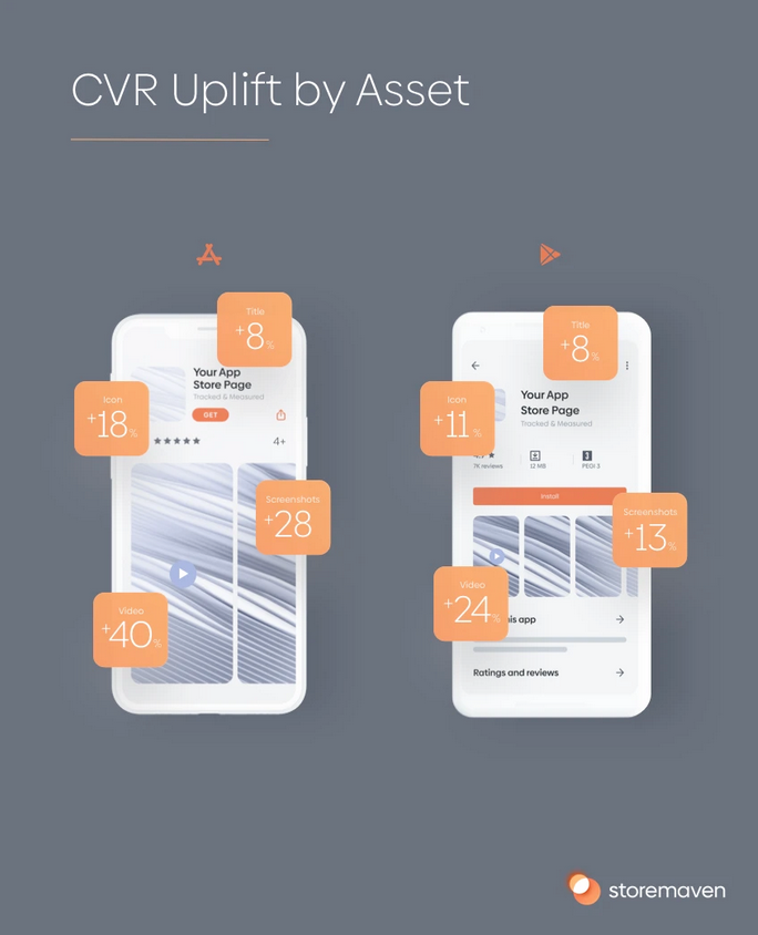
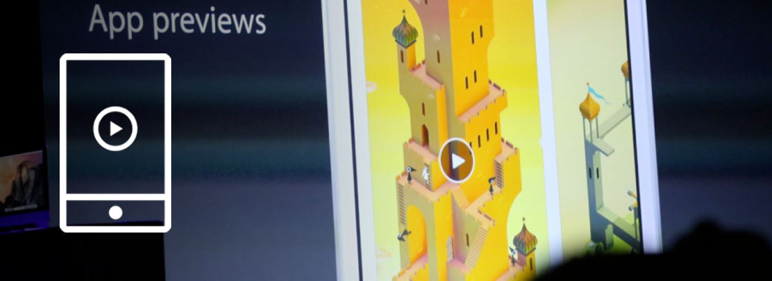
The screenshot’s impact differs depending on the store, but it’s still extremely relevant. Moreover, the app’s product page is not the only place where users will encounter screenshots. They will be visible on search results, the homepage, and ASA if you do not have a preview video. Which means they may be the key to getting the user to click on your app to find out more. According to SplitMetrics, less than 2% of users tap read more to see the full app description.
Screenshots will help you make a good first impression, and that can go a long way. Less than 30% of users ever go past the first impression frame of an app store page.
We dive into the importance of first impressions in app stores right here.
Show users what your app is really made of, and boost your conversion rate with efficient screenshots.
App Store and Play Store guidelines
However, in order to enjoy the benefits of well-thought screenshots, you will need to comply with Apple and Google’s rules.
Google Play Store requirements
Play Store’s screenshots need to fulfill the following requirements:
- Minimum dimension: 320px
- Maximum dimension: 3840px (The maximum dimension of your screenshot can’t be more than twice as long as the minimum dimension)
- Aspect ratio: 16:9 or 9:16
- Minimum of two app screenshots (and maximum of 8)
- You can upload different screenshots for tablet devices
- Maximum size of 8MB per screenshot
- Should be JPEG or PNG (with no alpha)
To be eligible for recommendations on the Play Store, you will need:
- At least 4 screenshots for apps and 3 screenshots for games and they must demonstrate actual in-game or in-app experience
- Don’t use call to actions
- Do not include information about rating, awards, performance, etc. (with descriptors like best, #1, top, discount, etc.)
- Localize your screenshots
- Make sure your screenshots’ text is readable, taglines shouldn’t cover more than 20% of the screenshot
Apple Store requirements
Apple’s App Store screenshots need to fulfill the following requirements:
- Minimum of one app screenshot and maximum of 10
- You can only use images taken within your app
- The screenshots must be in flattened JPEG or PNG RGB file format with 72 dpi resolution
- The aspect ratio and dimensions are device dependent and can be checked on Apple’s dedicated page however 3 screenshots sizes are mandatory: Three screenshot sizes are default and mandatory:
- 6.5-inch iPhone screenshots with corresponding portrait and landscape sizes
- 5.5-inch iPhone screenshots with related portrait and landscape sizes
- 12.9-inch iPad screenshots for 2nd and 3rd generation with related portrait and landscape sizes
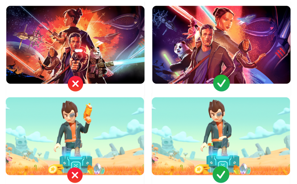
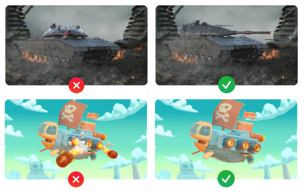
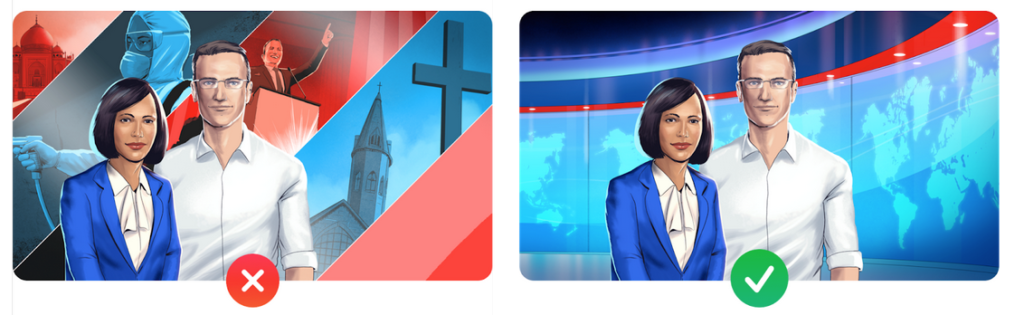
In addition to that, Apple forbids several the featuring of certain types of artwork in store creatives:
1. Blood, murder, or assault.
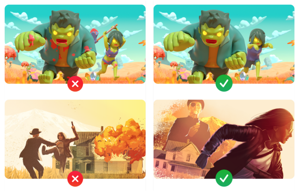
2. Sex, illegal drugs, obscene themes, smoking, alcohol, nudity, or profanity.
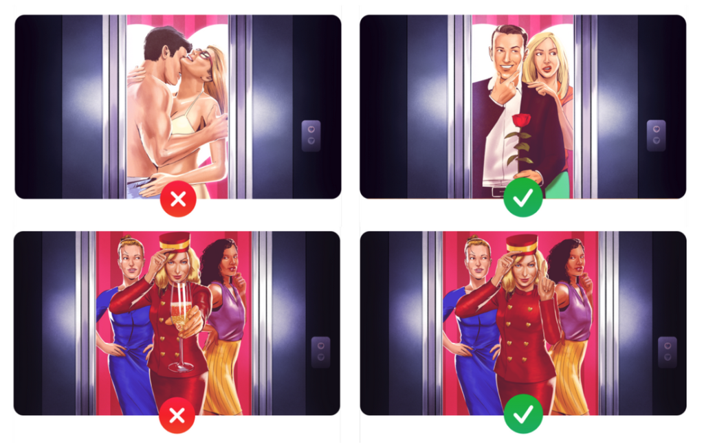
3. Realistic gun. Fantasy guns are allowed if they’re in a passive position (in a holster for example) and should not be aimed/firing at the user, this works for non-gun weapons as well
4. No references to pricing
5. No Devices, Hardware, or Electronic Products
6. No Sensitive Cultural References and Discrimination
What makes great app screenshots?
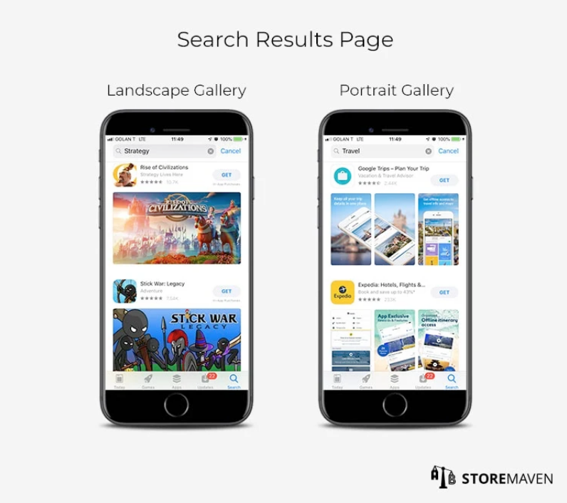
There’s a lot to take into account when creating app screenshots. Should you go with landscape or portrait for example? It’s not mandatory to use the inclination of your app or game, but it’s always recommended, it helps set users’ expectations.
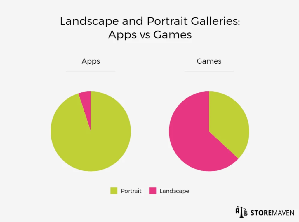
Just know that if you choose landscape, users will only see one screenshot at a time and will need to scroll to see the following ones, while with portrait orientation, they can see the first 3 on their screens (except if there is a preview video, in which case only two screenshots will be visible without scrolling in the Gallery.
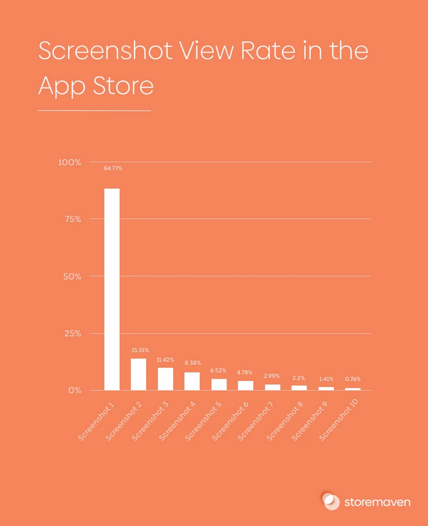
It’s important to hierarchize the information and features you’d like to showcase, and include the most important ones in the first screenshots. They are the ones ranking the most views.
It’s also good to always remind ourselves that the main goal of screenshots (and creative assets in general) is to clue in the user about what the app or game can do for them. Only a small portion of users read the description, so they will base their understanding of the app on visual assets.
Which is why they need to be clear and easily understandable. Avoid showing too much information in one screenshot, a good strategy is to show one info or feature per screenshot so as not to overwhelm the viewers. Unless you’re targeting Japan, in which case, according to Simon Thillay, you should aim for more cluttered screenshots.
However, it’s always important to ensure the information can get across. Sometimes, just increasing the size of the font can go a long way.
Screenshots should also be cohesive and linked to each other. They shouldn’t stand out from each other too much, otherwise, viewers might have a hard time understanding your product.
Strive to be as clear as possible, while infusing enough of your brand identity to ensure a lasting impact, especially with colors. For example, roughly 40% of apps use white as a background color for screenshots on both stores, and bright colors are rarely used, they could help you stand out but you need to be careful about their use and ensure that your text can be read without too much trouble.
Some tips to help you create memorable screenshots
- The first screenshots will be the most visible so this is where you should showcase the most interesting features
- Ensure your screenshots are sufficiently branded to improve brand awareness
- Choose a text color with heavy contrast with your background color to ensure readability
- Showcase one feature per screenshot (or one gamer motivation for mobile games)
- Avoid CTAs
- Always A/B test your screenshots, you never know which option users will prefer
- Do not use the same creatives for both stores, it can lead to a heavy decrease in installs
- Localize your creatives
- Add keywords and search queries to screenshots, it will remind users of the need they were looking to fulfill
- Analyze the competition, and try to stand out (with a different background color, for example, it will help you drive attention in search results)
- Make sure your font is big enough to be read comfortably from the Search results
- Less is more for screenshots, especially when targeting western audiences
- Mobile Video Monthly #38 – November 2023 - 5 December 2023
- Disturbing ads, a new trend for mobile gaming creatives? - 28 November 2023
- The Power of Holiday Marketing in Boosting Mobile Game Engagement - 21 November 2023