How a good first impression can boost your conversions
Creative Assets
October 13, 2022

A good first impression can go a long way, and that works for all areas of life. You never know where exactly you might first encounter your potential users, maybe it will be on social media, through one of your UA campaigns, or directly in the search results of their app store of choice.
You only have a few seconds to make a memorable first impression, it takes much longer than that to shake a bad first impression. It can be easy to underestimate the power of an initial perception, but actually, it can increase conversion by 35%.
Last but not least, you won’t get a second chance to make a good first impression, so make it count.
Ensure your app page is at its finest
70% of users never explore a product page past the first impression, so your visual assets will be the first and possibly only thing they see. People make really quick decisions once they’ve landed on your listing page. They won’t scroll down the gallery, in autoplay, they might see, at least, the beginning of your video asset.
And every user that downloads your app will land on your app listing page. Not all of them will land there first, some will come through paid UA, a social media post, your website, etc. so your listing will not always be where they get their first impression of your app or game. However, it will be the first thing potential organic users will see.
It’ll only take them a few seconds on your listing page to decide whether they will download or not your app. Sometimes even before that. Indeed, iOS users can actually see your app’s visual assets on the Search page.
Your creative assets will be the first thing they see, they will drive their focus and can influence their decision to not only download your app but also to click on your listing page to get more information.
Having a good first impression will rely solely on your visual assets, after all, only 5% of users (on both platforms) read the description. Not only that, but people spend an average of 7 seconds on an app page, quite a short amount of time to make a lasting impression. They do say an image is worth a thousand words, and visual assets can help you say a whole lot in under 7 seconds.
Stand out from the crowd with a good icon
The first visual asset they’ll see is your icon. They’ll encounter it early in the funnel, directly on the Search page. Use that to your advantage. Bright colors will help you drive attention, as well as a clear and recognizable logo.
Do not put too much text in there, icons don’t take up a lot of space on a screen and it might come across as cluttered or chaotic.
For mobile games, you can put one of the main characters of your game. This is a great way to garner attention effectively, and people identify more easily with human (or human-like) faces.
Making a great (and recognizable) icon is only the first step.
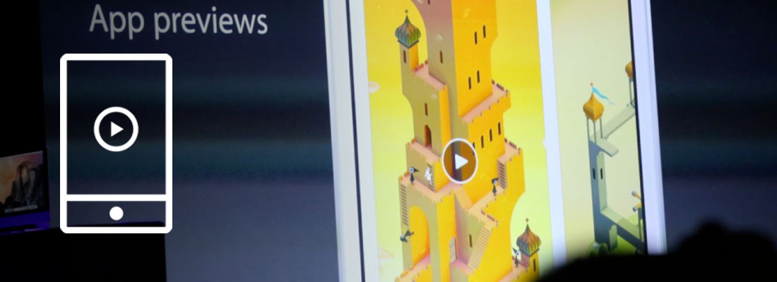
Nothing says “download me” like a preview video
If you have a preview video, it will be the first thing people see on your listing page. They have the best spot to drive attention, not to mention that the autoplay feature in the stores will inevitably pull the focus of the audience. The animation in the video on an otherwise static listing page are guaranteed to catch their attention, even if just for a little while.
Videos have been shown to have a higher engagement and conversion potential than images, 20% more on the App Store and 35% more on Google Play. They’re also essential for some app genres like gaming apps, which always perform better with a preview video.
A fifth of all users will not even have any other page interaction, their decision to download or not your app will be based solely on the preview video.
As said previously, you only have a few seconds to make a good first impression, so you need to start strong. Choose a powerful emotional hook to keep users entertained and curious, storytelling, for example, is a great way to keep their attention all throughout the video.
The most important information you’re trying to convey about your app or game should be in the first few seconds of your preview video. A good preview video will make a lasting impression, boosting your brand recall and your conversions.
Nobody puts screenshots in a corner
Screenshots will be relevant for apps that do not have a preview video, or those that have a preview video in portrait (this way, the first few screenshots will also be visible). If done correctly, they can increase your conversion rate by 28%.
Because we’re talking about making a good first impression, the focus will be on the first screenshots. Depending on the orientation of your app (landscape or portrait) or if you have a preview video or not, you will be able to see a different number of screenshots without scrolling in the gallery.
Rule number 1 is to show the most important information on the first screenshot with a clear and concise sentence. Go straight to the point.
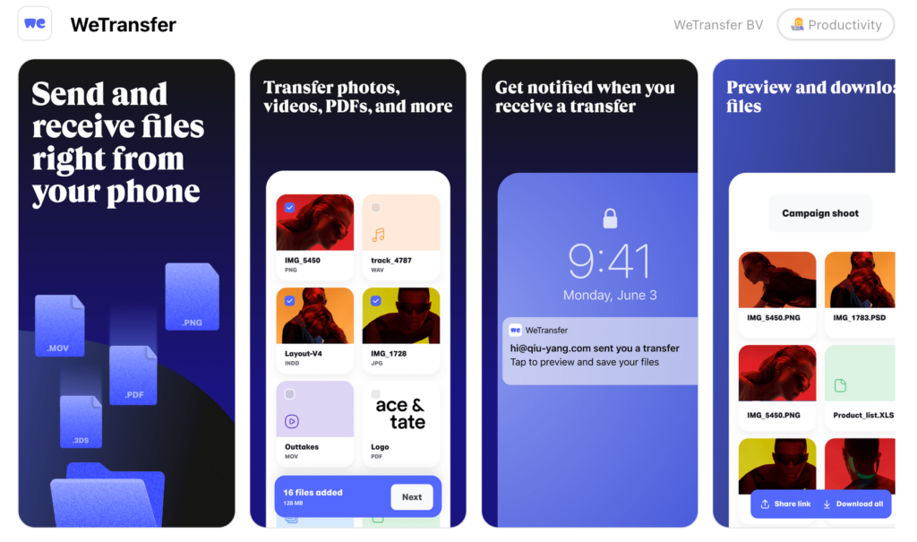
Look at WeTransfer, they’re describing in only 8 words what their app is doing. The details come in the following screenshots but the first one is very straightforward, you know what you’re getting after downloading the app. The heavy blue tint is a play on their official colors as well as the fact that the color is tied to a feeling of trust.
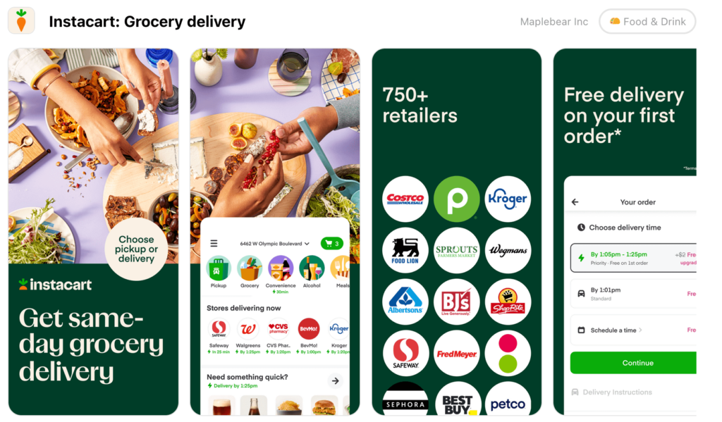
Likewise, Instacart goes straight to the point. The food image takes over half of the first screenshot and the text (in a big enough size) is here to tell you exactly what the app is there for and how useful it could be for you.
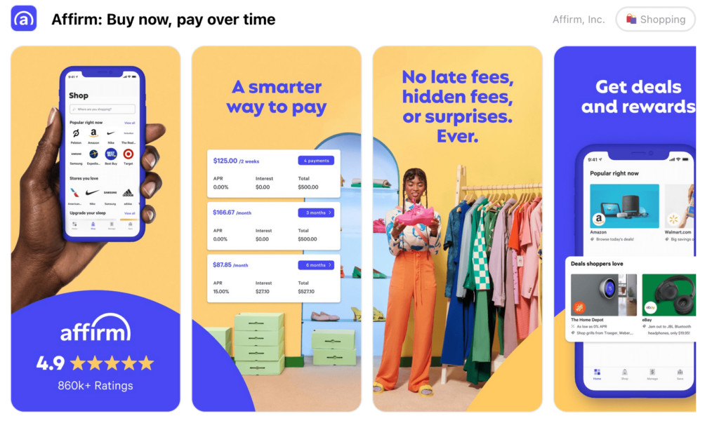
On the other hand, Affirm would like you to know about their great rating (aka social proof). Their purpose is shown on the second screenshot, the first is dedicated to showcasing their trustworthiness. And the contrast between the yellow and the blue is a great way to drive user attention.
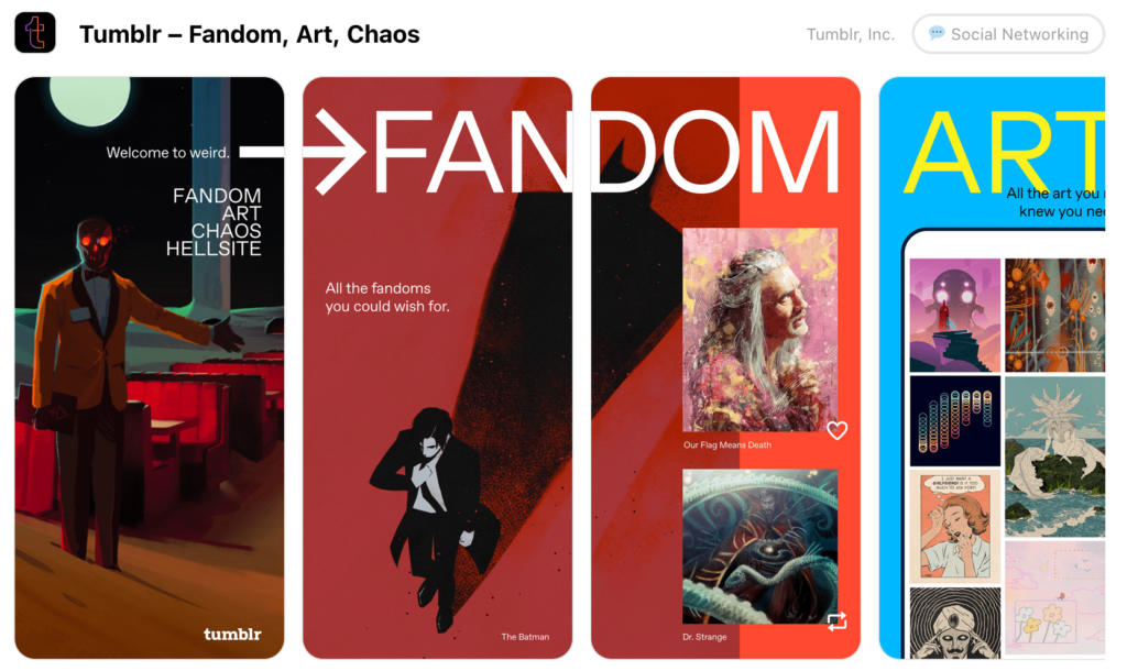
Tumblr is mainly banking on its fame, and now that they have a certain reputation. They chose only 4 keywords to describe their site (including Hellsite which is a denominator they often share with Twitter) as well as an unsettling image. The tagline welcome to weird is written in a smaller font than the rest of the text, hence the fact that it’s not here to drive attention away from the choice of keywords of the skeleton man greeting the user. They’re putting their aura first as a marketing tool.
Don’t rely solely on ASO, and cover all basis
Some people debate whether the egg or the chicken came first, in this household we’re trying to figure out if ASO or UA should come first. You need to be prepared for both options, once your listing page is dutifully optimized, think about your ad assets.
There’s a chance users won’t discover your app in the stores but elsewhere. If you invested in an ad campaign, it’s a good sign that they learn about you that way, it means it’s working. It also means that you must be careful about the image you’re presenting in those ads. Depending on where they encounter you, they may get a chance to skip on your ad so it’s essential to, as we said previously for preview video, put the most important information in the first 5 seconds of your ad. What do you want them to remember about you?
Even more than your regular UA campaigns, ensure that every way they can find out about you is covered. Do you have social media? Take a look at your social media strategy to see what image you’re putting out. For example, a cohesive feed is important on Instagram, whereas spontaneity is key on Twitter. What do people see when they open your profile? And does it match with what you want them to see and learn about your brand?
A good website is also essential. Viewers may not click on the ad but if they remember you, they may look you up later. A dedicated website ensures you have a landing page that can bring them to what they’re looking for (your social media to stay up to date or your app’s listing page to download your app). And you can control what information you’re showcasing. It’s a great way to polish your brand image as well.
From a striking icon to a strong brand identity
Ensuring that you’re providing a good first impression also has long-term benefits (aside from convincing viewers to download your app). Indeed, it will do wonders for both your brand image and your brand recall.
To build a nice rapport between your brand image and your audience you need a robust foundation, this is what a good first impression can provide you. If their first look at your brand (whether in the app stores or through an ad) reaps positive feelings, it will boost your brand recall and they may not download your app right away but they’ll remember you fondly and will come back later.
Your first impression can also be the hook you use to catch their attention. Look at Merge Mansion’s ads, they’re aiming for a mystery tale, and that works for them and helps make people remember their brand easily.
The first few seconds of interaction you will have with your audience are crucial in shaping their image of you, your brand, and your product. Don’t underestimate it.
If you need any help to produce creatives that will impress people at first glance, reach out to Apptamin’s team! We’re here to help.
- Mobile Video Monthly #38 – November 2023 - 5 December 2023
- Disturbing ads, a new trend for mobile gaming creatives? - 28 November 2023
- The Power of Holiday Marketing in Boosting Mobile Game Engagement - 21 November 2023