App Preview Poster Frame – Examples and Best Practices
iOS App Previews
February 4, 2019

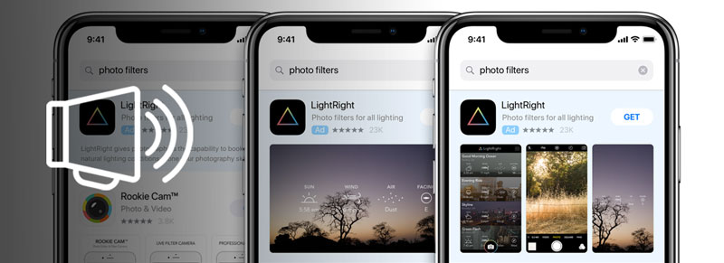
When Apple first introduced iOS App Store videos (called “App Previews”), those videos did not autoplay.
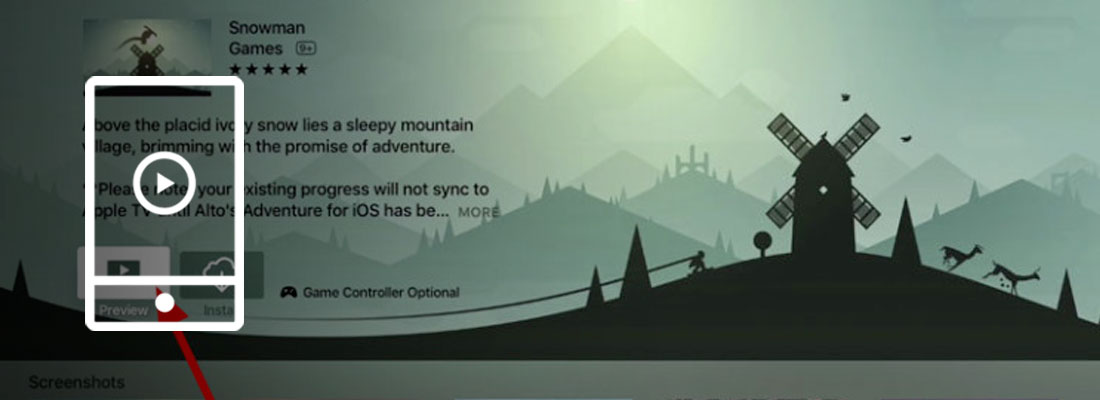
This means that there was a play button on top of the App Preview video thumbnail, which Apple decided to call “poster frame”.
Because this poster frame was displayed first in the “gallery” (where the screenshots are), it would “replace” the first screenshot (or more exactly, it would be placed before it). To watch the video, visitors would have to tap that play button. This was very similar to how the play button for the promo video is now displayed a Google Play Store listing.
The poster frame was therefore one of the most important creative assets of an App Store listing. Surprisingly, it was still widely neglected.
Since iOS 11, App Preview videos autoplay both in the App Store search results and on the product page. This makes the poster frame (the “video thumbnail”) less critical. However because it occupies primary real estate in the search results and the product page, it is still something that developers need to get right (yet often get wrong).
In this post we’ll first take a look at what are poster frames, how they are now displayed, why they are important and how to select them. Then we’ll go through interesting video poster frame examples on the App Store, some “fails” and share a few best practices.
What are App Preview poster frames?
The poster frame is a frame/image of the App Preview video that Apple uses as video thumbnail:
- Before the video autoplays (for a split second, or more for slow connections);
- When a competitor’s video (above or below in the search results – including Apple Search Ads) is playing;
- For users that enabled “Low Power Mode” in their settings and currently have low battery (i.e. low battery disables autoplay)
- For all users that turned off video autoplay in their phone settings.
This frame needs to be planned ahead so it’s part of the video to make sure it fits nicely with the app’s screenshots and emphasizes the right things. If the screenshots are changed (and therefore the value propositions put forward change as we;;), the poster frame might need to be adjusted.
It’s not about just having a pretty image (although that’s good too), it’s also about having the right messaging. And a messaging that complements nicely both the screenshots (especially the first 2 ones) and the start of the video itself.
Why are App Preview poster frames are important?
Do you feel your app store screenshots are important?
If the answer is yes, then by now you probably have a good idea of why these video thumbnails are important.
Because the poster frame “takes the place” of the first screenshot, it is one of the most important App Store creative assets.
Yes, it is displayed for a very short time. But there are so many instances that can lead to this poster frame being seen by potential users (see a few above) that you need to get it right.
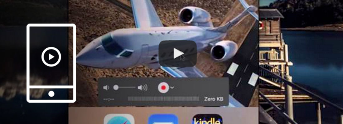
How to set your iOS video poster frame or thumbnail?
To select the poster frame (video “thumbnail”) of your video on the App Store, you first need to upload the video on iTunes Connect in the Media Manager.
Once the video is uploaded, Apple seems to select by default the frame that is at second 0:05 of your video.
But this might be a terrible frame!
So what you want to do is hover over the App Preview video for which you’d like to change the poster frame and click Edit Poster Frame.
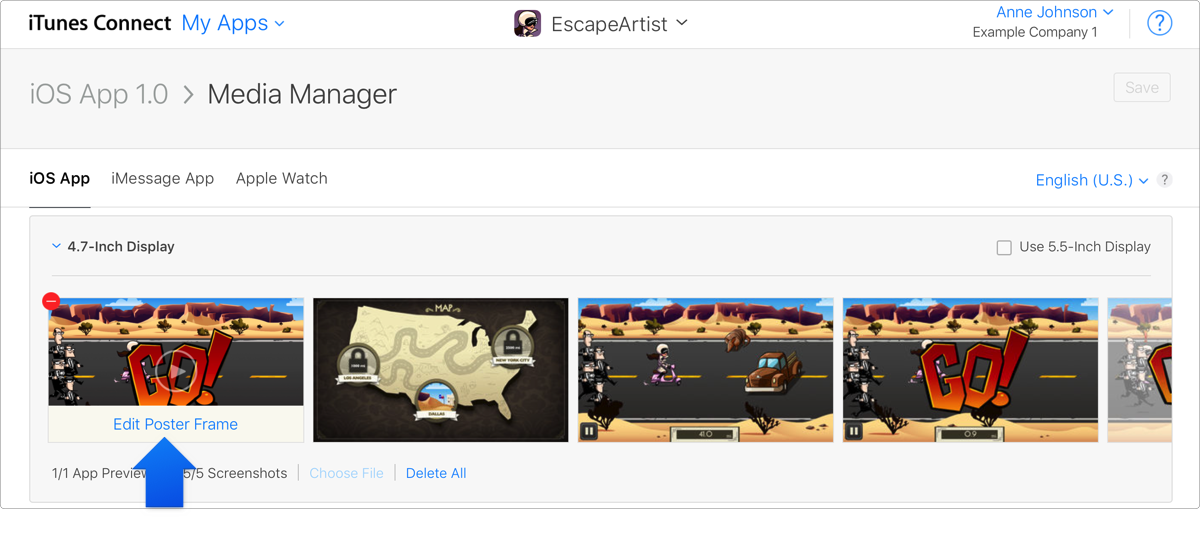
You then get the option of setting a different poster frame by playing the video and stopping where it’s the most relevant.
Once that’s done, you save the changes.
15 examples of great App Preview poster frames
A lot of developers do set a specific poster frame and don’t overlook it completely.
But who does this right? Who plans for that poster frame as they are creating the video, so that everything on the App Store listing fits nicely together?
To really answer this we would need data from A/B testing poster frames on the App Store…And we know that’s not possible (yet!).
But we went through the top 50/100 apps and games and listed 15 examples of poster frames that we believe are nicely planned or set.
Note: we are not “judging” here the app, the screenshots or even the video. Just the App Preview video poster frame and how it fits with the rest in the search listings.
McDonald’s
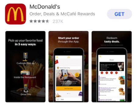
This poster frame works well. Like on the screenshots next to the video, we have a background with food. On top is illustrated (and explicitly mentioned) the main value proposition: with the app, you can pick up McDonald’s curbside, in the restaurant or driving through.
The messaging on the 2 screenshots complement this well, with further details: you order through the app, and you can even get deals.
The only improvement we see here would be to make the text easier to read.
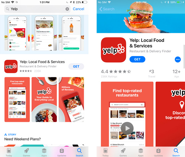
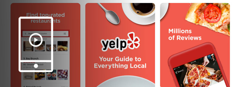
Yelp
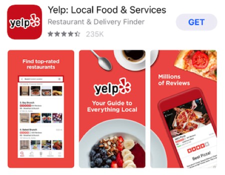
This poster frame almost looks like a screenshot as well. It is however part of the video, and works great in the search results: in the 1st screenshot (in the middle) is branding and the main value proposition. On each side information that complements this.
The only downside of this App Preview poster frame is that in the search results it’s a bit hard to see the UI clearly when displayed smaller like this. But between the copy and the main elements of the UI (like the ratings) it’s easy to understand you’re looking at a list of restaurants.
Ebates
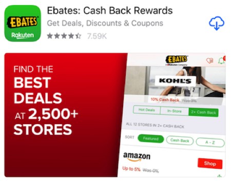
For landscape App Preview videos, the poster frame is even more important: there are no screenshot to display additional information.
The poster frame by Ebates is very much “in your face”, but it got a lot of things right:
- Easily readable copy (the landscape format helps!);
- A great preview of the UI with: branding, the kind of brands you can get deals on and even cash back examples.
Mimi Music
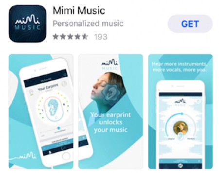
This is an example that has been on the App Store for a while, and Mimi Music definitely planned for that poster frame.
Branding and the main value proposition is in the 1st screenshots (in the middle), and the phone frame on the left is “overlapping” it as well. What they did in terms of implementation is adding a specific frame/screenshot at the very beginning of the video, for a split second: just enough to select it and so that even when the video autoplays you get a glimpse of it.
Star Walk 2
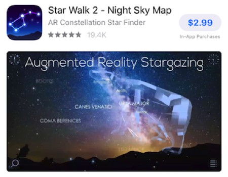
The poster frame that Star Walk 2 chose out of its App Preview video is explicit and makes it easy to understand what the app is about, both through copy and showing examples of constellations.
Toca Life
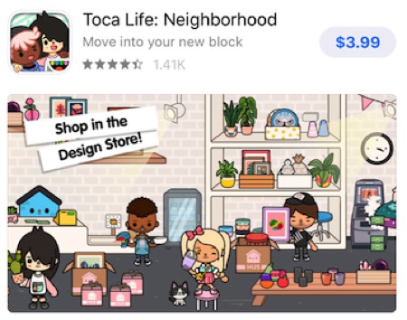
Toca is not new to the game, and it’s no surprise they get their poster frames right.
For this one the gameplay is nicely chosen and the copy on the top left makes it easy to understand the game further.
Popular Wars
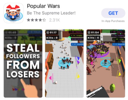
The thumbnail for this App Preview video is hard to miss.
Used along screenshots showing the gameplay, it helps explain the purpose of the game and give some context.
Fortnite
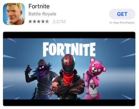
Fortnite has a branding advantage, so it makes sense to put it front and center in their App Preview poster frame. They therefore decided to select a frame from the end screen of their videos, that has the Fortnite logo as well as some (famous?) characters.
Episode & Choices
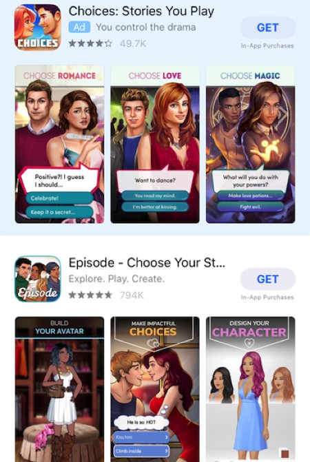
We grouped these 2 poster frames as they are for very similar apps, that chose a similar approach when it comes to their screenshots and their video poster frame. They are also competing for the same keywords, which clearly shows above with Choices targeting the Episode keyword via Apple Search Ads.
Both apps created their App Preview videos in a way that allow them to select a frame looking like the rest of their screenshots (and that complements them).
Subway surfers
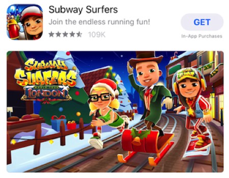
Subway Surfers is quite a popular game and they decided to put the brand in evidence by selecting a frame of their end screen, like Fortnite did. This works well and the case of a specific theme also helps reinforce it, like here with London during the holidays.
8Ball
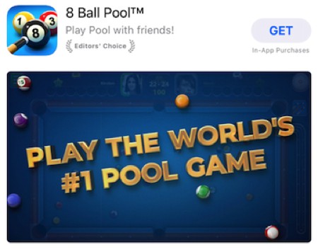
Big copy can be a great way to grab the attention of App Store visitors, and this is 8 Ball Pool’s approach. The #1 pool game claim is pretty powerful, and they displayed the text intelligently: over a pool table with some balls, in order to set the atmosphere.
This is a short frame/sequence they added to the beginning of their App Store video.
NBA 2K Mobile Basketball
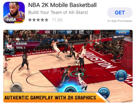
For the poster frame of this game, the developer chose a great action shot from gameplay and added compelling copy.
This poster frame from the very beginning of the video also fits great with the rest of the screenshots on the Product Page.
Brick n Balls
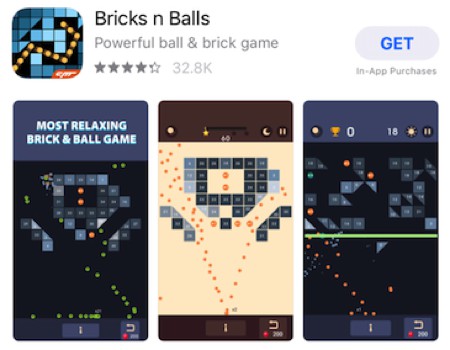
Here too we have another claim that comes and gives some important context about the gameplay displayed in the screenshots.
Looking at similar games on the App Store we see that most do not have copy on their screenshots and this might help the app stand out.
Hitman Sniper
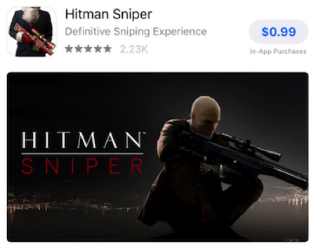
We’re unsure how popular this game is, but one thing is clear: the poster frame of the video is very explicit as to what kind of game this is. It displays the name of the game (which doesn’t really leave room for confusion) as well as the main character in action. One quick look and you know what this game is about.
Dragonvale
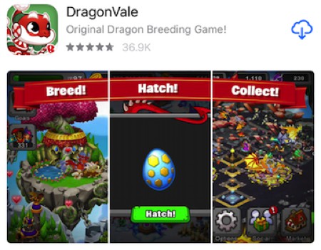
This poster frame is pretty clever, and something we’ve only seen once or twice on the App Store. While the video is a landscape video, the poster frame is created as if it was three separate “continuous” screenshots.
This has the advantage of presenting a “storyline” with copy and gameplay. This can be used by any app to present 3 different features or benefits, and can be an interesting way to test landscape video in the search results without taking too much away from the portrait screenshots you’re replacing.
10 App Preview poster frames “fails”
For the most parts these are not really fails per say, we’re oversimplifying here. Some “Clickbait” so you would look at this section 😉
That said, the poster frames below have most likely not be set on purpose or really thought through. And we see some room for improvement!
Walmart
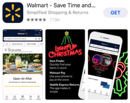
The frame chosen here does not really reflect the “essence” of Walmart and what you can do with the app. Instead it focuses on one theme (Open-Air Affair) rather than showing different products from the store.
It doesn’t help that the holiday season is probably not when people are looking for outdoor furniture.
Venmo
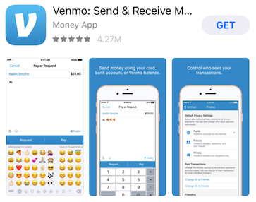
It looks like Venmo did not change the default poster frame. It could be interesting to show the UI, however a few things are not ideal here:
- The UI shown between the poster frame and the 1st screenshot is very similar, besides the emojis;
- It is fairly hard to read/understand when small;
- If you can read, then it’s too bad to have just “XL” in the field instead of “XL 🍕🍕🍕” which makes much more sense.
We think it could be interesting to place a very short video sequence where Venmo would select a more compelling frame (maybe with big copy).
Hulu
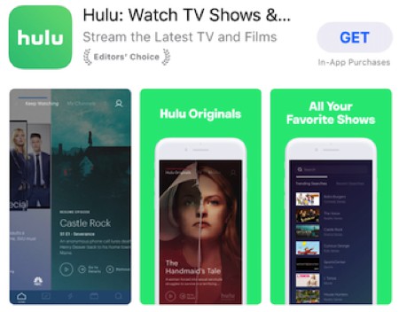
This poster frame has to be something that was overlooked: it is set in the middle of a swipe. Choosing a frame just slightly before might have allowed to show two famous titles they carry at the same time, and that could have been interesting.
But here, it feels like a missed opportunity to convey more about what the app brings.
GrubHub
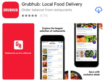
GrubHub is pretty well known, and it can make sense to display the logo again as the poster frame to reinforce branding.
However we think that 2 small things could be improved:
- When the video starts, we see the text animation that leads to that screen (the poster frame). So for the first seconds of the video, there is not really any added value. It might be best to just have the screen with the text already there and then start the video directly. Or animate just the text, not everything (including the logo) again.
- Copy is pretty small and hard to read. Because “Grubhub” is already written on the icon and as the app icon, it could be interesting to have only the text “Restaurants you love, delivered” in very big as the poster frame.
It all looks pretty good but if you compare to Yelp’s poster frame and screenshots we talked about earlier, it does not feel as polished and compelling.
Google Home
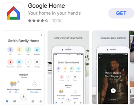
In its video thumbnail, Google is displaying the same thing as in the first screenshot. And is therefore missing out on an opportunity to show another aspect from the app.
This is also something we see very early in the video (the poster frame is most likely the default one) and in many parts of the video. So maybe choosing one of the frames with copy (like the one “All your compatible smart home devices at your fingertips” – although this is long) could be better. Or showing the living room light adjustment screen.
Dropbox
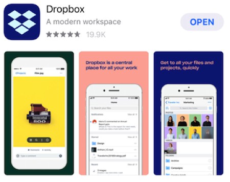
To us, this App Preview poster frame does not reflect dropbox and what it does.
It has the merit of grabbing the attention because of the color, but we feel it could be better. Just selecting the first text screen “Store & access all your files” and then starting the video from there would probably be best.
TouchRetouch
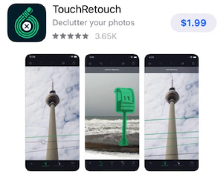
It’s pretty clear here that the iPhone X poster frame set is not ideal: it is almost identical to the 2nd screenshot. This is surprising because the iPhone poster frame (below) has been carefully planned.
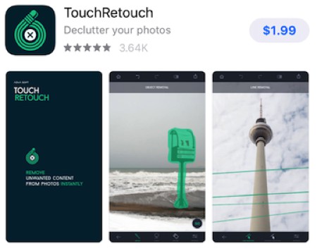
Just a reminder to set the poster frame for each of your videos!
Happy Glass
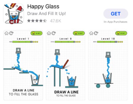
We have a somewhat similar thing here, with not much difference between the App Preview poster frame and the 1st screenshot.
If the goal is to show differences between levels, then the gameplay part could be the same but the copy could be different. In the second screenshot it could for example be about how it gets more difficult or how it’s harder than it looks.
Gone Home
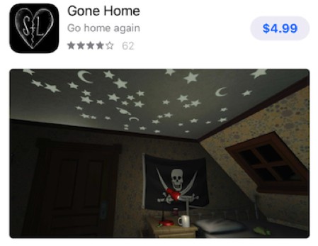
This App Preview poster frame shows a screenshot from the gameplay (or from a cinematic sequence).
This is ok, but if you watch the video you’ll see that there could be much better poster frames. For example less than a second before and after there are 2 “social proof” screens that would be great candidates:
- Same gameplay but overlaid with “The greatest video game love story ever told” – The New York Times;
- Same gameplay but with awards from a bunch of reviewers.
Roblox
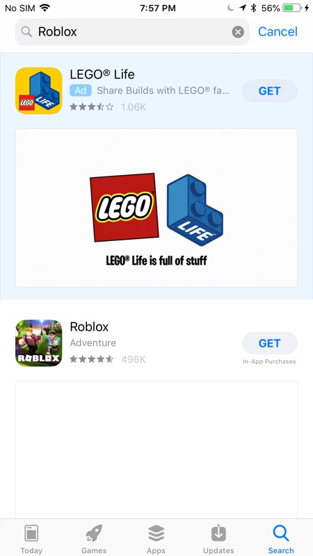
Last but not least, this one is pretty surprising because it seems it was chosen on purpose (it’s in the first frames of the video).
Yet it is just a blank screen. When there is an Apple Search Ad above (which seems to happen a lot), this is not very compelling.
A lot of other frames, if not all of them, would probably be better.
Best practices for App Store video poster frames
What can we learn from these examples (and some common sense)? Here are a few tips we put together.
Think about your video poster frame when creating the video
Don’t let your App Preview poster frame be an afterthought.
When you’re writing the script for your App Store video (please do write a script before starting, you will thank us), think about which frame for the video would make a good poster frame.
Think about the poster frame like you would think about a screenshot
As we’ve seen, your poster frame is not much different from your app store screenshots.
It is quickly “replaced” by the autoplaying video, but still displayed for a bit alongside your actual screenshots.
So it makes sense to not only consider the video and its thumbnail, but also how they fit in with the screenshots.
You don’t want the poster frame to:
- Display the same thing (or something very close to) the first screenshot
- Look odd amongst the screenshots from a branding or design standpoint
This consideration of “fitting well with the screenshots” is slightly less important for listings with landscape creative assets, as a landscape poster frame will take the full width and less visitors see your first screenshot.
Think about what happens after the poster frame
Videos autoplay on the App Store. Quickly after visitors see your poster frame (unless a competitor video above is playing), they see the start of your video.
If the beginning of your video basically “replays” what’s in your poster frame but with an animation, you’re wasting precious time. It’s best to structure things so that people keep seeing and discovering new things about your app as they progress in the video.
Use (short) copy
In most cases, it is smart to use short and powerful copy on your App Preview poster frame. It can help be very explicit about what your app is about.
Just don’t make it too long, as most people won’t have much time to understand what’s written.
Select the poster frame for all your videos
Selecting your the poster frame of your iPhone App Preview won’t select the poster frame of your iPhone X or iPad App Preview. So make sure you do it for each video!
We hope these few examples and tips will give you ideas on how you could improve your own App Preview poster frame. If you have additional insights to share, leave a comment below!
Follow Apptamin on Twitter
Follow me on Twitter


Very descriptive article with lots of examples. Audience can make a view point about your app from the app screenshot section. So if you are adding a video, then make sure it highlights the key features of your app
Hello Sylvian,
Great post, Definitely poster can play an important part in any App promotion. As poster can attract customer most if we have designed it properly with simple and clean design.