Google Play Feature Graphic Examples and Best Practices
App Store Optimization (ASO)
January 25, 2023

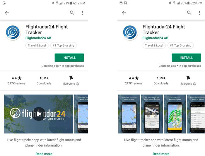
Like the App Preview Poster Frame (for iOS App Store videos), the way the Google Play Store feature graphic is displayed on a listing has been evolving.
Even now, the feature graphic remains a very important App Store Optimization asset. And that’s especially true if you have a promo video on your Google Play Store listing.
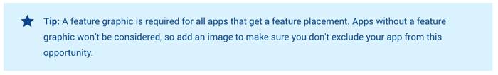
To publish your app, the Google Play feature graphic is actually required even if you don’t have a promo video because Google wants to have it in case they decide to feature you.
What is the feature graphic and why it is important?
Because you might read posts that still talk about how and where the feature graphic was displayed before, let’s quickly address this.
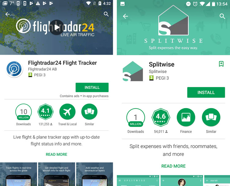
So it was at the very top of the Google Play Store listing. For everybody.
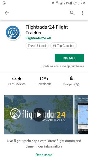
But since the Google Play Store redesign, the feature graphic is now displayed before your screenshots. And if you added a YouTube promo video to your app store listing, there is a Play button overlaid on top of it that allow visitors to watch your video.
If you do have a promo video this makes it one of the most important creative assets of your listing, right along with your app icon and even more critical than your screenshots.
If you do not have a promo video, the feature graphic will not be displayed on your listing.
But don’t think you shouldn’t pay attention to it though. Here’s what Google says:
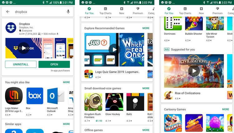
The feature graphic can also be displayed:
- When doing a brand search;
- In the “Recommended” section on the Play Store;
- In the Ads section on the Play Store (if you’re running Google’s App Campaigns and they are displayed on the Play Store).
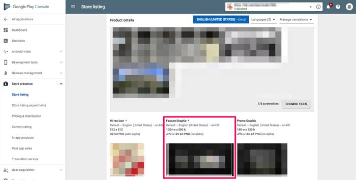
Here are the requirements for the Google Play feature graphic:
- 24-bit .png (no alpha) or .jpeg
- 1024px by 500px dimensions
The good news here is that the feature graphic is an asset you upload, not a frame of your video like the video thumbnail on the iOS App Store.
Why is the feature graphic important?
We already answered this: because it is one of the most visible creative assets on your Google Play Store listing.
It’s easy to understand that because it “pushes” your screenshots, it really “replaces” them as far as the first impression is concerned.
The feature graphic that is displayed once you add a video therefore plays a double role:
- It should compel visitors to play your promo video and watch it;
- It should convey your app’s value proposition.
This is not easy to achieve.
How with just one graphic can you do all of this, since it’s already hard to do with several screenshots?
The short answer is: with a mix of great visuals (including branding) and, in a lot of cases, copy. For the long answer and examples, keep reading.
Something else to consider is that if you’ve worked hard to get featured by Google, you want people that see your feature graphic to try your app.
Because it’s such an important ASO asset, you should also A/B test your feature graphic with Google Experiments or an A/B testing platform like SplitMetrics or StoreMaven.
How to upload your Google Play feature graphic?
This is easy to do.
In the Google Play Console, go to your store listing. In the Graphic Assets section, below your screenshots, you’ll find where to add your feature graphic.
Side note: if you want to change the thumbnail of your promo video for people seeing your Google Play Store listing on desktop, you need to change your YouTube video thumbnail directly on YouTube.
15 great Google Play feature graphic examples
Overall top developers seem to pay close attention to their feature graphic design.
Giving the possibility to A/B test it with store listing experiments we can also assume they’ve tested it, since it’s one of the most important assets!
Let’s have a look at several interesting examples you can draw inspiration from.
Episode
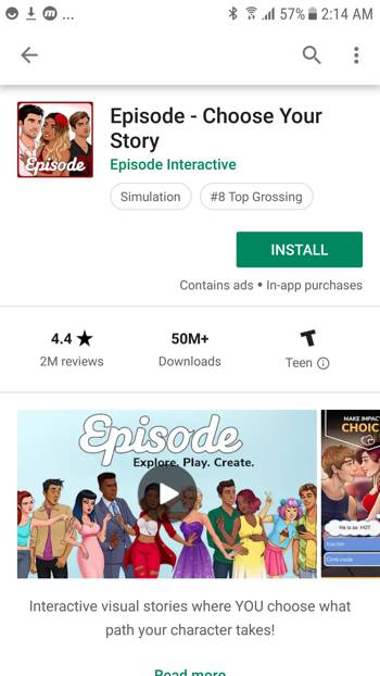
This feature graphic example from Episode checks pretty much all the boxes.
The colors are bright and the image catches the attention. The game characters they have showcased give a good idea of what you’ll then find in the game, and the way they interact with each other already creates storytelling.
They added branding through their logo, and use a tagline to give better insights into what the game allows. This complements nicely the app title they already have, without repeating it.
McDonald’s
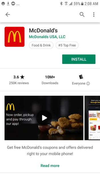
When writing our post on App Preview poster frames we shared that they’re doing a good job on iOS.
It’s the case here as well where they manage to clearly convey what the app allows users to do.
They’ve also added their iconic M (which you can’t miss on the dark background!) and a food background so potential users already salivate.
Matchington Mansion
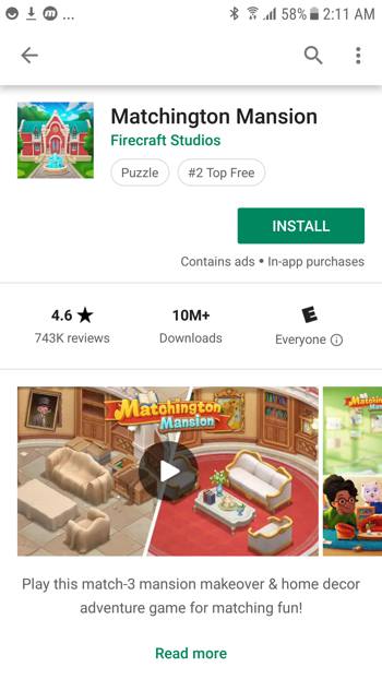
We wanted to share this Android feature graphic from Matchington Mansion because it uses the split screen concept.
The game is about renovating your mansion, and showing a before/after visual works pretty well here.
Interestingly enough on the graphic there is no mention at all of the match-3 aspect of the game. Since this is something that is only shown in their 5th screenshot, we can probably assume that this is not the main selling point they use.
Something that could be worth testing is actually having a “before” and “after” mention like they did on their second screenshot.
Kick the Buddy
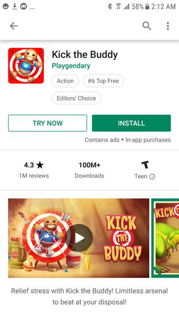
This is definitely a carefully crafted feature graphic.
They did a great job at illustrating many ways you can “kick the buddy” and the asset is totally in line with the game’s design.
The layout of the feature graphic is also good: there is not any important visual element below the play button.
Light-it Up
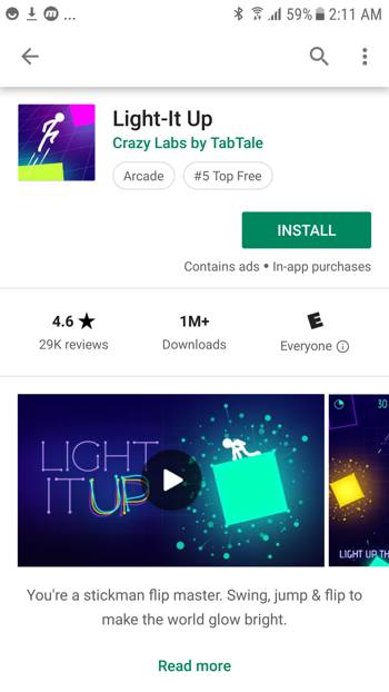
Like for Kick the Buddy above, you can tell that the developers carefully thought about their feature graphic.
The logo on the left is made of lights and very stylish, and on the right they’re showing the game’s main character in action like if he was ready to get started.
Lords Mobile
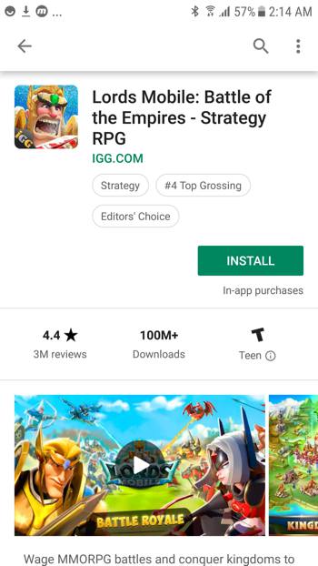
What we like in this feature graphic example is how it puts in opposition 2 teams by showing characters on each side.
The visual is very polished and conveys the essence of the game through storytelling.
With the big trend on battle royale games, they also added the corresponding copy to make sure people would get the battle aspect straight away.
Only thing that might make it even better would be to figure out a better placement for the game logo, since here it is mostly hidden by the play button.
Pandora
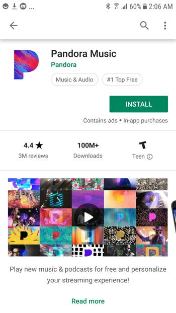
We like this Google Play feature graphic from Pandora because of its artsy style and the meaning behind it.
It combines several designs, which evocate (to us) the diversity of music that can be found as well as the app’s personalization capabilities.
Each design also has the Pandora “P” logo, reinforcing branding without being repetitive with the app icon.
That said it would be interesting to test adding some short copy that tells users more about what the app already allows (for those who don’t know). We would also be very curious to see an A/B test where they make a feature graphic out of their first 3 screenshots (see below – maybe less text-heavy though).
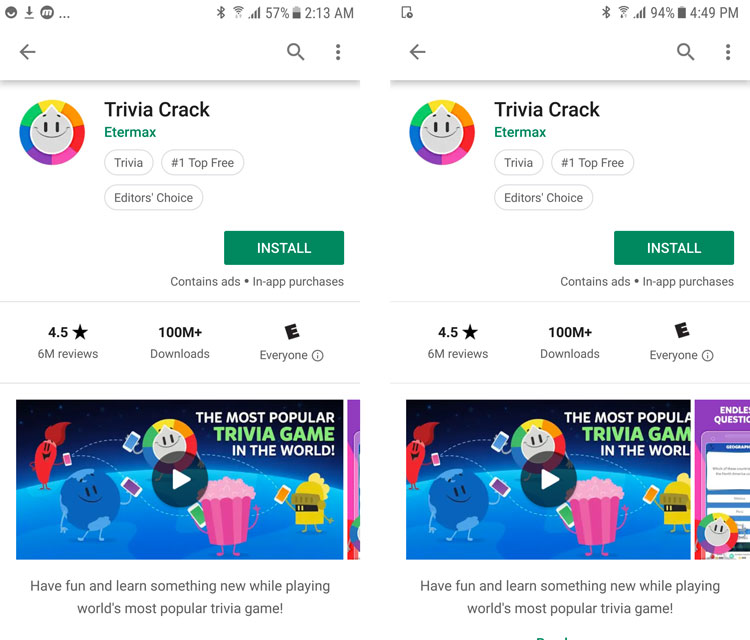
Trivia Crack
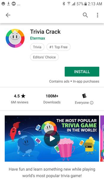
We love how Trivia Crack is leveraging social proof in this feature graphic example!
Not only do they have a clear text claiming the most popular trivia game, they used characters from the game to visually tell us more about the app.
In the app each character is used for a category, and here in this feature graphic we have them (and the logo) playing together on top of the world/earth.
Along the following screenshots they also re-use these characters which gives some branding consistency to the full listing.
Best Fiends
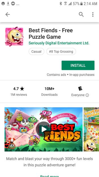
If Best Fiends keeps this feature graphic for too long, then it might end up in the “fail” category.
But if we assume that we’re still close enough from Valentine’s Day, then this is an interesting use of seasonality for a feature graphic.
They have several elements in Valentine’s day’s spirit (envelope, banner) and they featured the game’s characters in a playful way.
The layout is smart because the play button doesn’t block anything important.
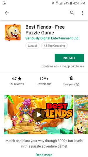
Update: shortly after we captured their Valentine’s Day feature graphic, Best Fiends updated it.
Candy Crush Saga
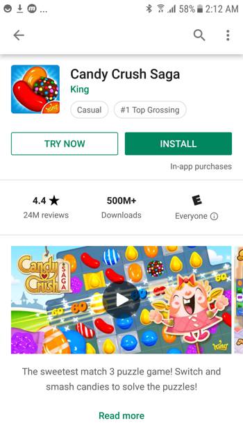
Here’s another match 3 that has its feature graphic game together.
The game’s name is leveraged with the logo in the corner, but not too big so that the focus stays on the game elements used.
In the frame the focus is on the zoomed-in match 3 gameplay with some special effects, which makes it very clear what the game is about. And the girl character on the right adds a sense of excitement.
Roblox
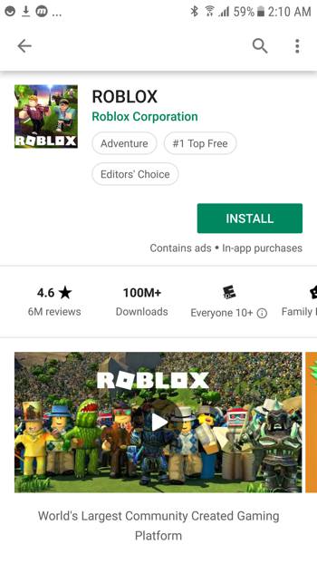
We were definitely not fans of Roblox’s white poster frame on the iOS App Store, which we see as a missed opportunity.
But it seems that the feature graphic was not overlooked.
They did a good job at showcasing a huge variety of characters to illustrate the game’s diversity. Not only in the foreground but also in the background with a crowd of other characters (ok, this is harder to see), which ties in well with their “world’s largest community” message.
The logo is placed perfectly above the play button and super easy to read.
GoodRX
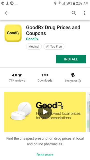
We like how GoodRx has included an image representing prescription drugs in their feature graphic. The bright yellow color definitely grabs the attention and the way they integrated the pills’ image with the drop shadow shows they paid attention to details.
Along with the app’s logo and a tagline, it conveys well the main value proposition.
Magic Tiles 3
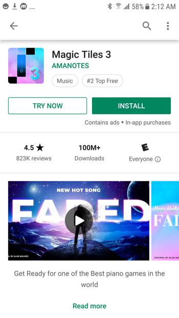
This is an interesting example of using a feature graphic to promote the latest star content available in an app.
Magic Tiles 3 is a piano game, and the full feature graphic is dedicated to the “new hot song”.
However we believe it was not necessary to also have a first screenshot with the same messaging, and probably a better idea to start showing the game directly.
Sniper 3D Assassin
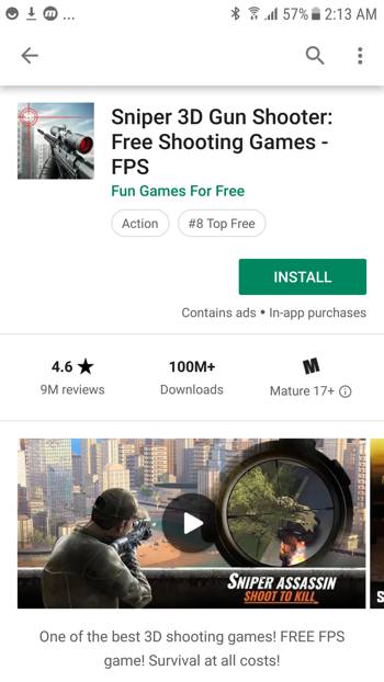
This feature graphic has a great layout: on the left we clearly see the game’s character holding his weapon. The eye is quickly drawn to the right and what the character is seeing in is telescoping sight.
Anyone can quickly understand what the game is about.
The developer also used the wall (darker part of the image) to display the games’ name and tagline.
Wordscapes
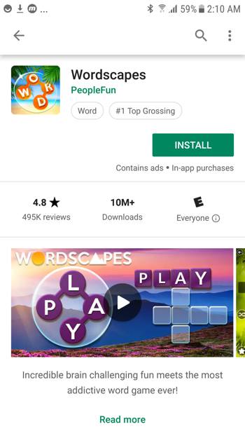
We like this feature graphic for the Wordscapes game because it uses reconstituted gameplay elements (word game over landscapes) and smartly uses the gameplay letters to form PLAY.
Branding is visible yet not the main focus, and the play button doesn’t block anything important
5 feature graphic “fails” on the Google Play Store
We’re not saying everything is bad in the following examples, but they are representative of the pitfalls you can easily avoid when planning for your app’s feature graphic.
TextNow
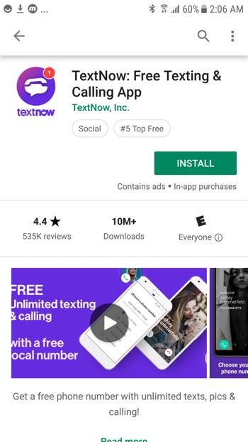
The layout of TextNow’s feature graphic is actually pretty good. The app’s value proposition is summarized on the left, and they are showing the app in 2 devices on the right.
The problem is that TextNow is making one of the most common mistakes when it comes to feature graphic: there are important elements (text in this case) on the edges of the image. On some devices the feature graphic is slightly cropped which makes it harder to read.
Since most likely happens because the developer hasn’t updated the feature graphic since Google’s redesign, when it was displayed at the very top of the listing. And several apps are in the same case (check yours!).
Granny
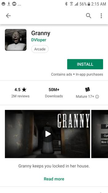
We mentioned this when talking about Magic Tiles 3 a bit earlier: there is no need to repeat the messaging from the feature graphic in the first screenshot.
In the listing of this game, the developer went even further and basically showed the exact same screen (with the addition of menu buttons).
With so many (scary) scenes/images to choose from in this game, we believe the first impression could be much more impactful.
POF
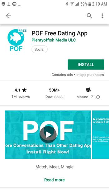
Since we took this screenshot it seems that POF has updated the feature graphic (with a cute heart made of fishes).
The one you see here is another good example of why you shouldn’t place any copy on the edges of your feature graphic.
Idle Supermarket Tycoon
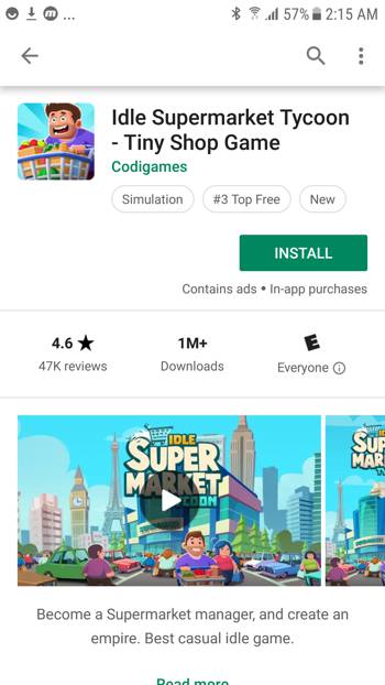
The feature graphic of Subway Surfers is actually pretty cool. We see characters from the game in action in the game’s environment, the game logo, etc.
The problem here is pretty much the same as with Granny: the first screenshot is just a repetition of the feature graphic.
This probably made sense before the Play Store redesign (when the feature graphic was at the top of the page), but now it’s just a loss of space: it would be much better to have what is currently their screenshot #2 (with the “Become rich with your market” screenshot).
Audible
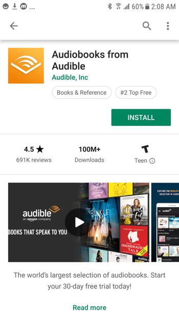
This feature graphic for Audible would definitely have its place in the great examples section of this article…If it wasn’t for the text that is too close to the edge.
Other than that it is really well thought out: the logo and tagline are super easy to read on the left, and on the right we see book covers. The play button is right in between and makes it feel like it has its own place!
Best practices for Google Play feature graphic
After all these examples you probably have a good idea of the best practices we recommend to follow. But just in case, below is our summary.
Think of all the possible placements
As often with App Store Optimization and creatives, a good place to start is to understand everywhere the feature graphic might be displayed: we saw at the beginning of the post that it can be on the Play Store listing, when doing a brand search and in the recommended or ads section.
Yes, your feature graphic should complement the rest of your listing. However, seeing the different placements (and Google also says it) it is clear that your feature graphic might be displayed alone (and apparently even without the app icon). This is important to keep in mind.
Ensure consistency with screenshots
The feature graphic might be displayed alone in some instances, but the main placement is the one before the screenshots on your listing.
So you want your app’s feature graphic to be consistent with your other Play Store listing elements and especially your screenshots. Here is Google’s take on this:


Google also recommends to use vivid foreground and background colors so the feature graphic stands out from the Play Store listing’s white background.
Don’t repeat the feature graphic in your first screenshot
Being consistent in style should not mean duplicating.
Your screenshots will not be displayed completely by themselves (or in very rare occasions) so there is no need to have a first screenshot being the same (or using the same visuals like what we saw in the Idle Supermarket Tycoon example). Doing that means you risk losing people exploring the rest of your screenshots.
Convey the right message
Google puts it this way: create a story and a sense of context to humanize your app.
If you have a promo video then visitor’s first visual impression on your Play Store listing is your app icon and your feature graphic.
That’s it.
You do have the short description below the feature graphic to help get your message across, but you should make sure that your feature graphic asset shows and says the right things about your app.
Be aware of what can be cropped
We’ve seen through the examples that having your feature graphic cropped on your listing is very common.
Even though the cropping may vary depending on users’ devices, no one should see an asset that is not complete.

Stay away from the borders!
Be aware of the play button
This is not overly complicated, but needs to be taken into account: if you have a promo video there will be a play button in the middle of your feature graphic.
Luckily, the play button has some transparency to it that prevents from completely blocking a big part of the image. However it’s better to find a layout where the most important things are around the button.
When designing your feature graphic, add a layer with the play button to make sure it works well (don’t forget to remove it at the end of course).
Use large and short copy
You don’t want to overload your feature graphic with text. Or any graphic for that matter.
But a very short tagline or a couple of descriptive words can go a long way to give Play Store visitors a better sense of what your app is all about.
Like your screenshots, your feature graphic is displayed fairly small so make sure any copy is easy to read even at a small scale.
Localize
There’s a caveat to adding your app name or additional words to your feature graphic: you need to localize your feature graphic for your main markets/languages.
This seems to be often overlooked, even by Top 100 apps and games.
Other apps or games go further, by even adapting the visual part to some locales.
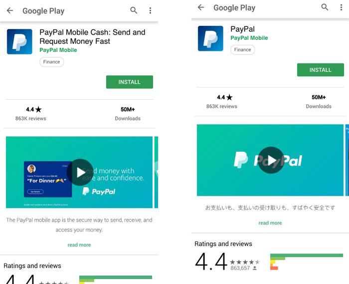
One way to tackle this localization aspect can be to have your feature graphic (with text) for your main localization, and for the other ones to have a feature graphic without any text. This seems to be PayPal’s approach.
A/B testing
Since the feature graphic is one of the most important App Store Optimization assets on the Play Store, you definitely want to A/B test it with store listing experiments.
Here too, start with your main market before deploying (or adapting) to all your other localizations.
Other considerations
A couple of additional considerations below:
- Making your feature graphic seasonal or time sensitive can be helpful to promote events, sales or new content (like Magic Tiles 3 does). But only do this if you know you’ll be able to update it across the board when the time comes!
- The size of your screenshots seems to affect how much of them users see next to your feature graphic and apparently also how cropped your feature graphic can get (see image below)
Interested in seeing all the best practices Google has listed out? Check out this page (not fully updated however, at the moment they are still referring to the old Play Store design).
That’s all we got. A lot of it is common sense, yet several Play Store listings could easily make improvements to their Play Store feature graphic. Hope these examples, tips and best practices will be useful to you! And as always, let us know in the comments if we missed anything.
Follow Apptamin on Twitter
Follow me on Twitter

Hi there, we are about to launch our Android app and we need a feature graphic and screenshot content. We launched our iOS last year so you can also check that out in the app store and see how we can improve it.
We need this work to be done asap so i would appreciate a reply pretty soon. cheers.
Hi Tye – approving this comment only now but I now one of our team members got back in touch with you that same day